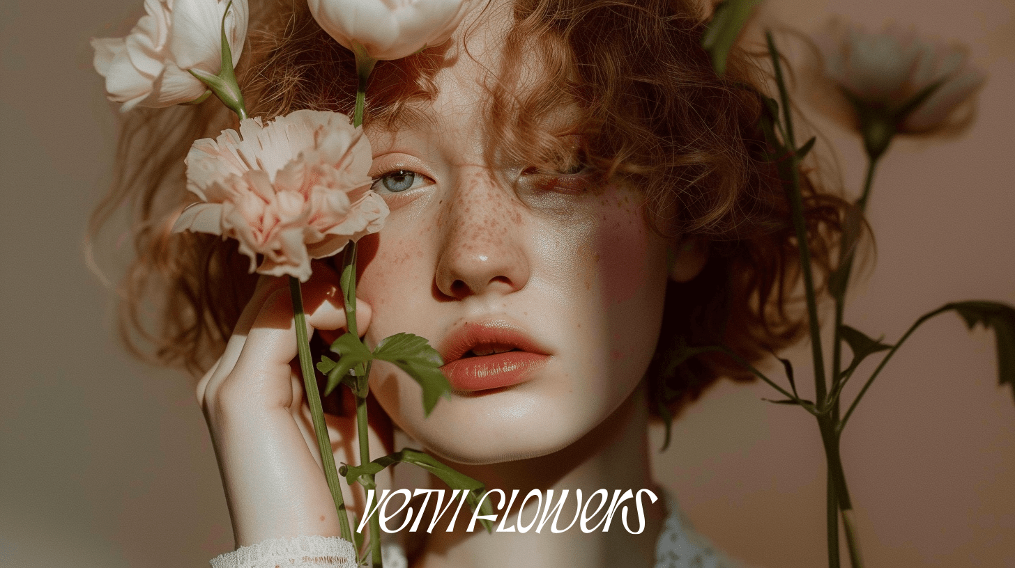
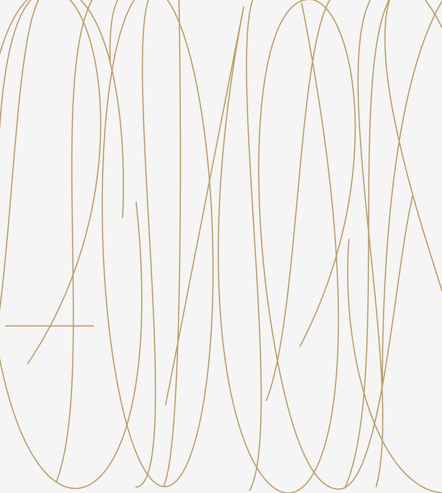
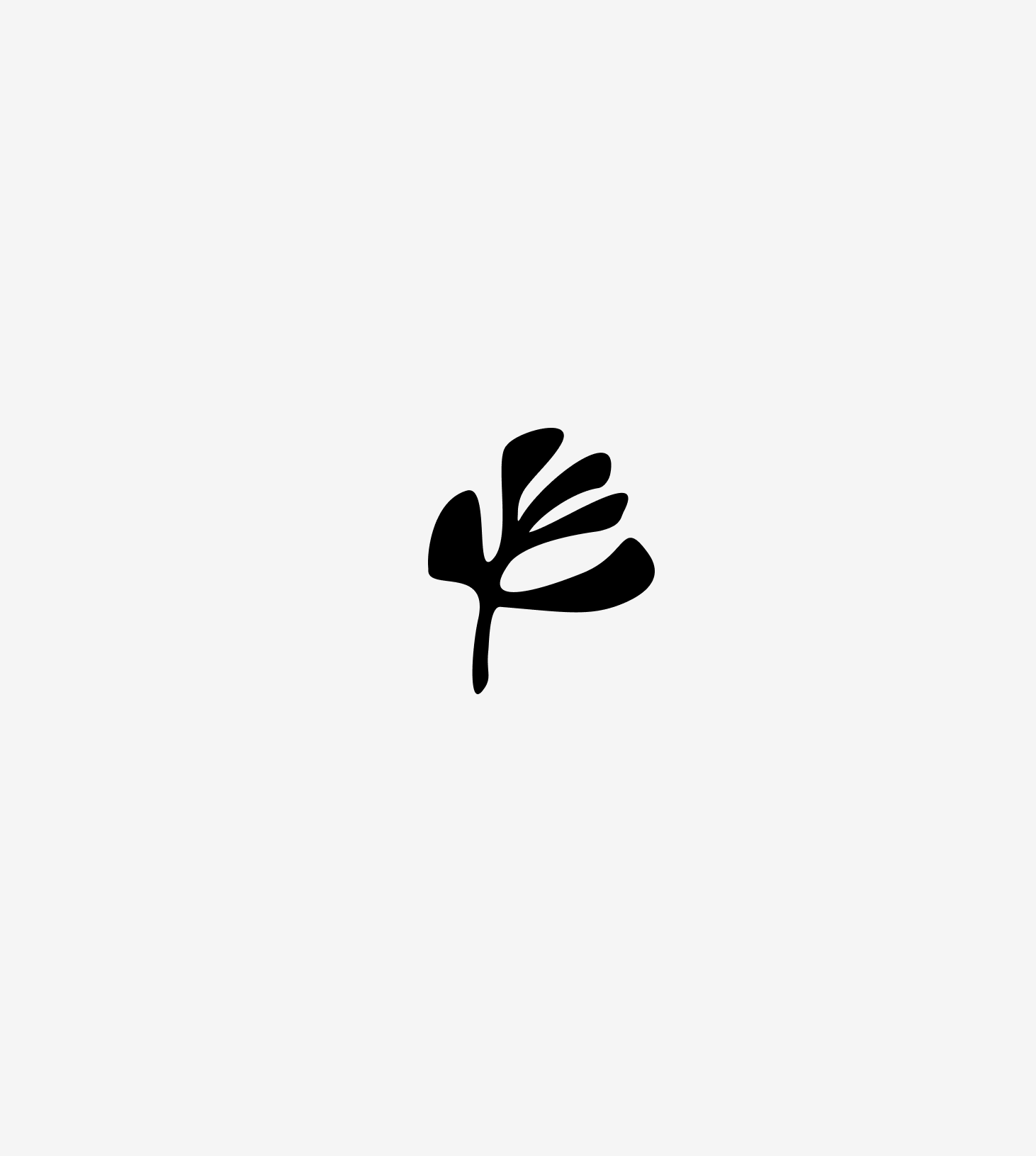
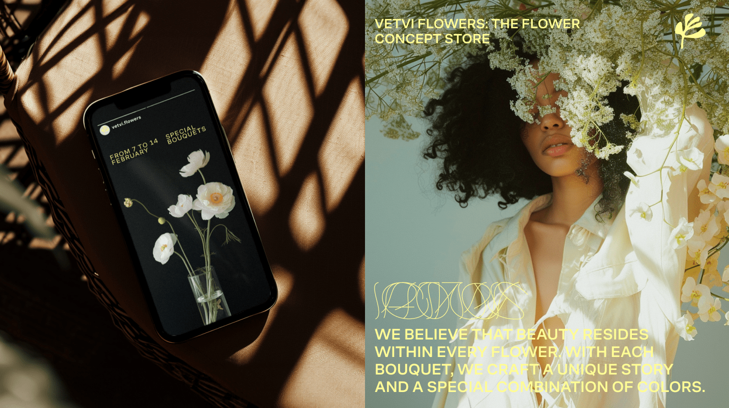
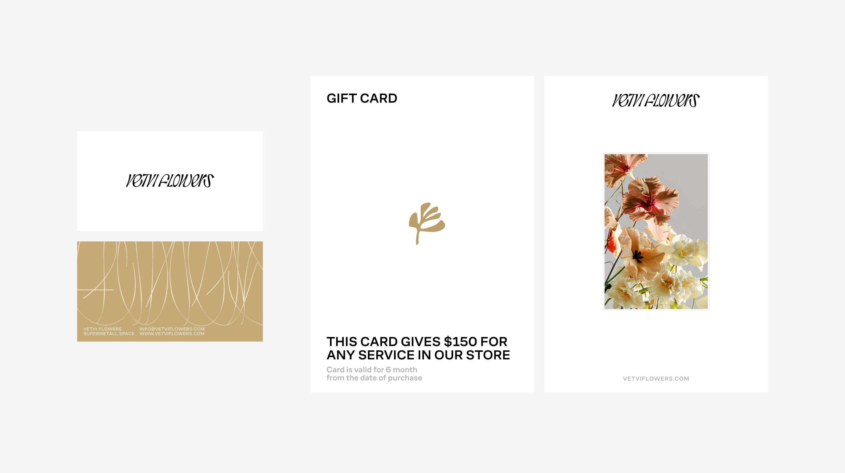
Vetvi Flowers is not your typical floral shop; it's a unique floral concept store where one-size-fits-all bouquets don't exist. Here, individuality takes precedence, and every customer receives a personalized bouquet. The logo embodies the idea of layering and natural dynamics, with the graceful lines of the second layer merging into the first, emphasizing the brand name, "Vetvi". The primary layer serves as the main logo, while the second layer acts as a graphic element, functioning as additional artwork, much like a pattern that fills the entire space. This design exudes simplicity, functionality, and uniqueness, mirroring the core principles of the store's concept.