
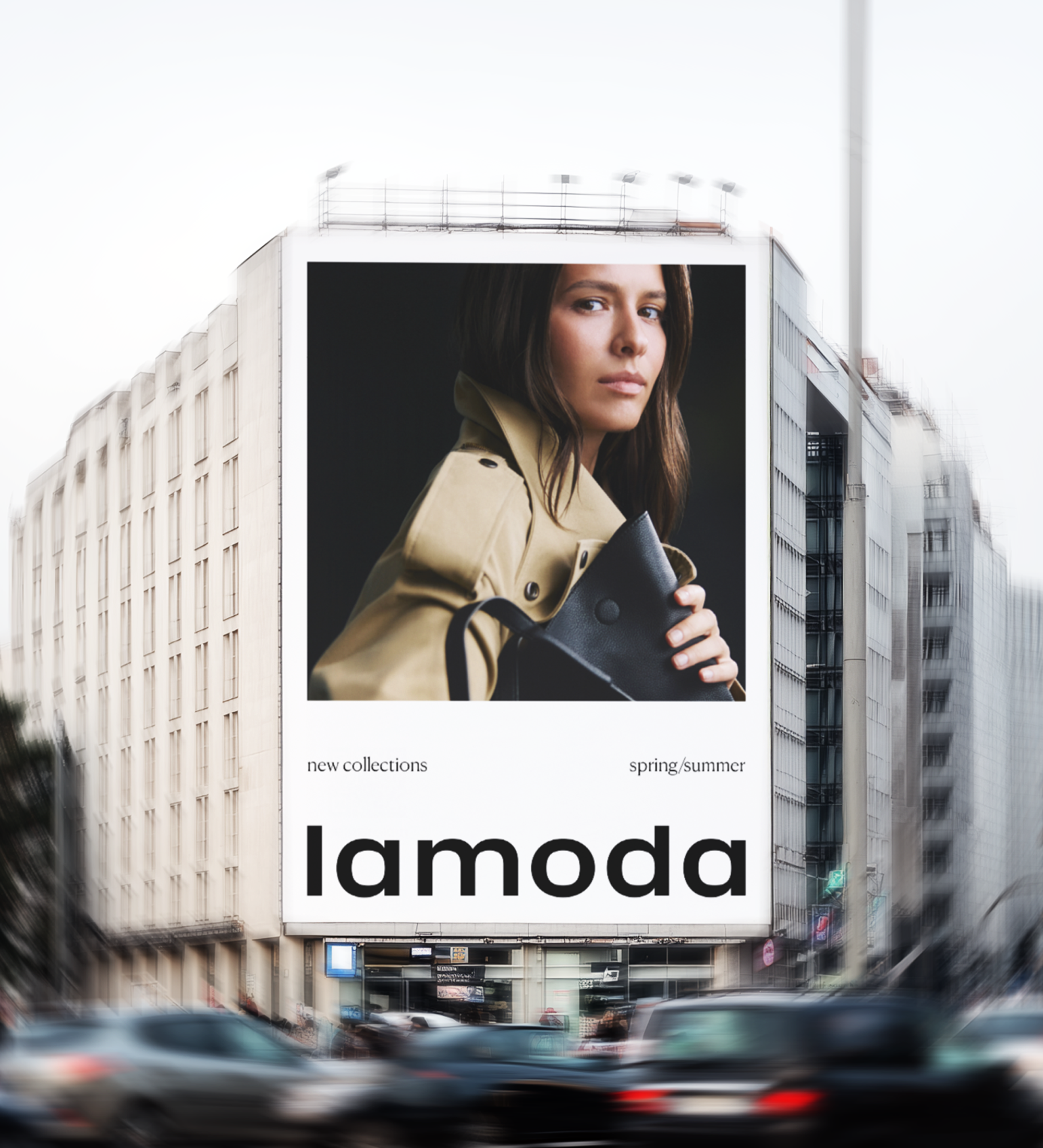
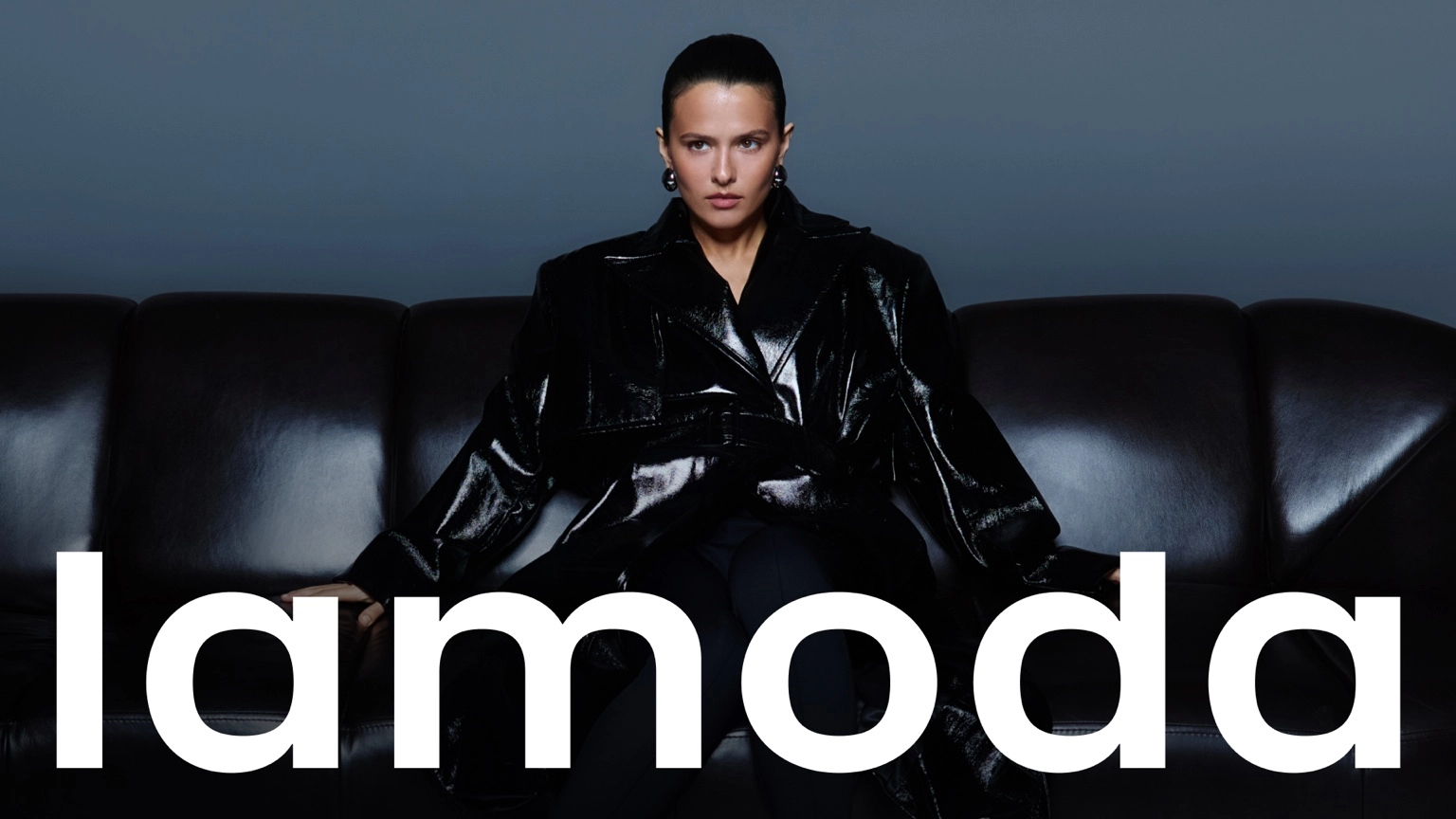
Today, lamoda is redefining its role: to be a guide into the world of fashion and individual style through technology, content, and a curated assortment. Lamoda is a platform where authentic products, personalized service, and fashion expertise help customers discover their style and express their individuality. These changes are happening gradually and are now reflected in the restyling of the brand identity.
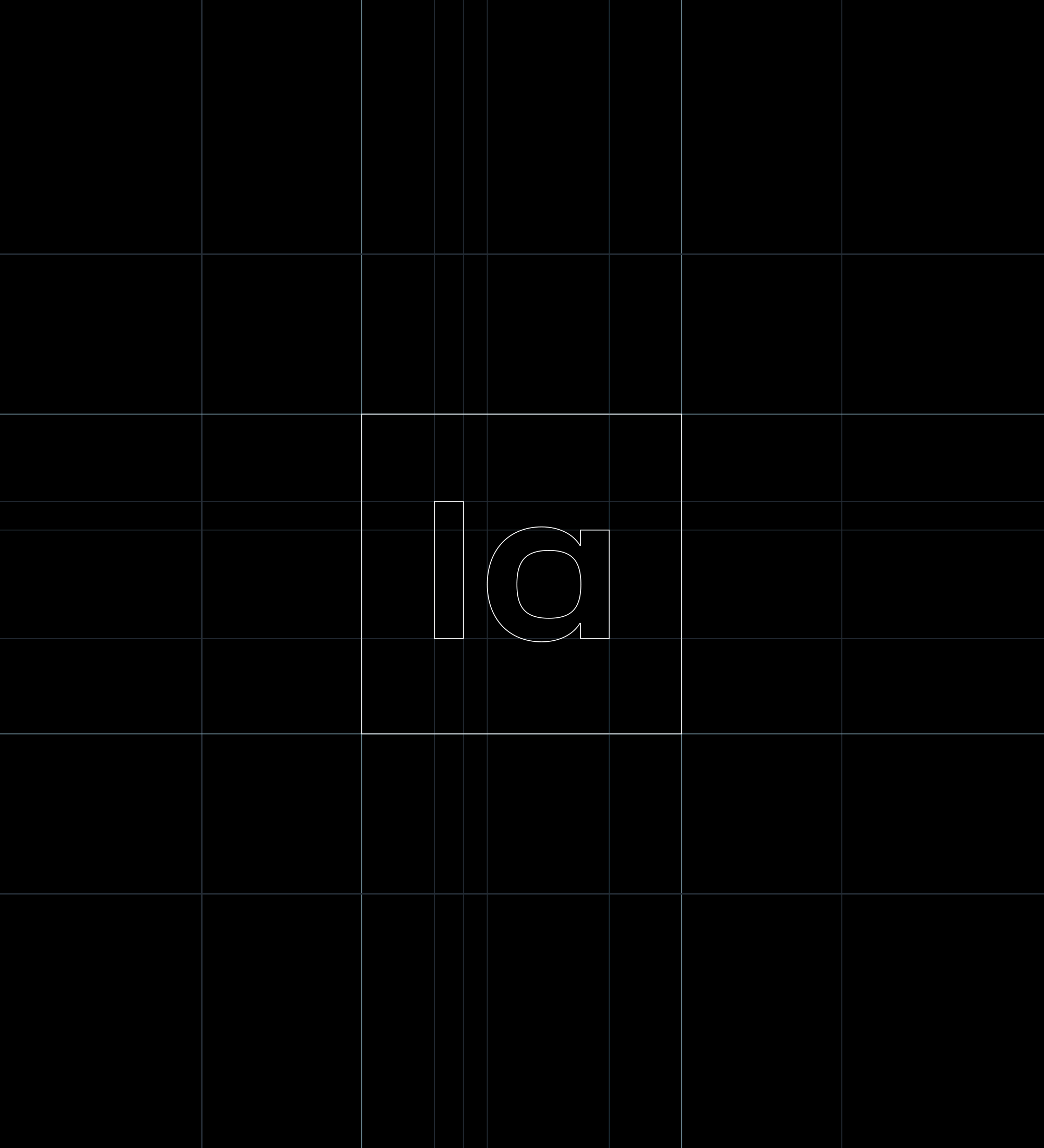
The logo was refined to align with the updated visual direction of the brand while preserving the familiar proportions and character of the original mark. Subtle reverse contrast references the historic version of the logo, while small optical adjustments improve clarity across different sizes and inverted applications
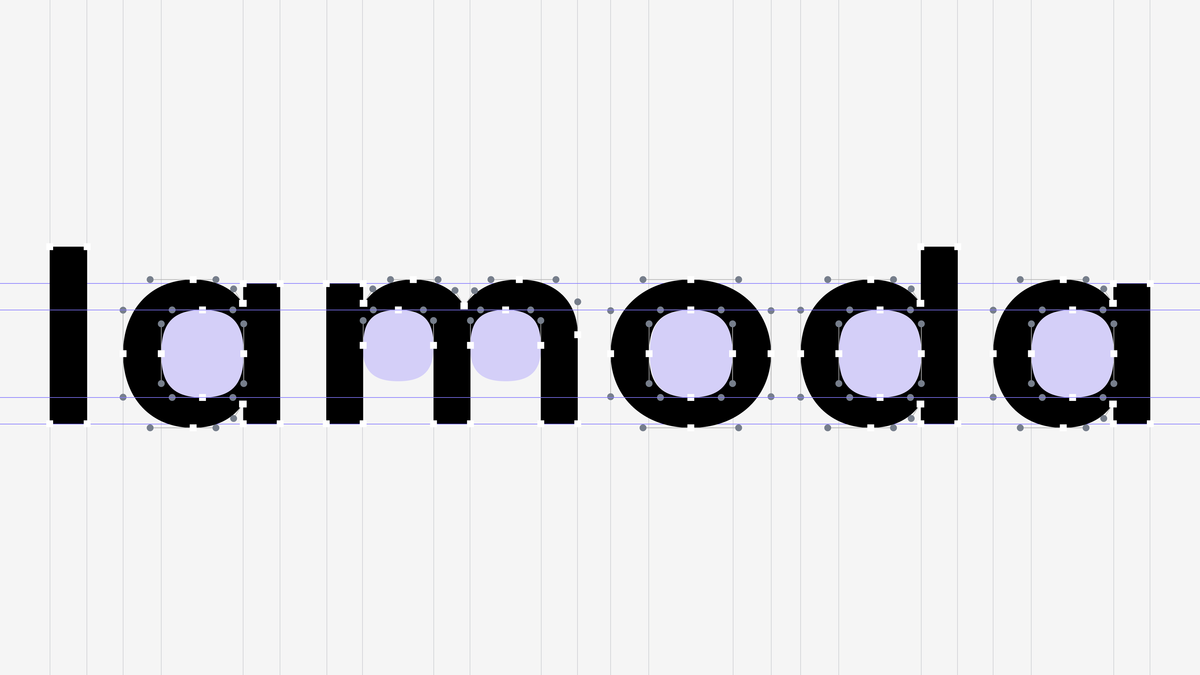
The square module has become the unifying thread of the identity, echoing patterns found in many fashion brands. This symbol was used to create a flexible system of patterns, typographic techniques, photographic style elements, and the logo mark.
Design Concept
Neizvestnie Studio
Art Direction
Lamoda Design Team
Wordmark
Nikita Sapozhkov